Albertsons
Eat Life Up
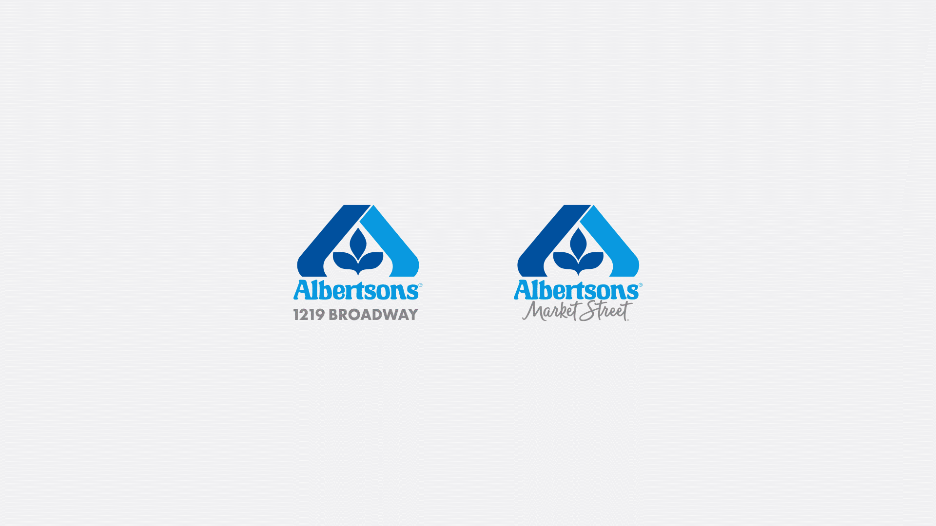
Albertsons Companies has existed since Joe Albertsons started his first store in 1939 in Boise Idaho. Since its inception it has become the nation's second largest conventional supermarket chain. 80 years after its origins Albertsons decided to take on a new premium concept store, one that focuses on foodies, quality ingredients, and products made by people who lived in and around the Idaho region. Thus Albertsons 1219 Broadway and Market Street (The largest Alberstsons asset in the United States) were born.
My role as the creative director was to build a visual identity system based on pre-approved interior and graphic design concepts. Over the course of a year I worked with a team of designers and copywriters to build standards that ensured a consistent brand for new and existing stores.
Role:
Creative Direction
Identity Systems
Graphic Design

The Problem:
Albertson’s visual identity felt outdated and with a growing population in the Boise Idaho area the company wanted to give its newest stores a look that felt more contemporary to reflect the foodie first environment they were trying to foster.
The Objective:
Build a set of brand standards for designers, videographers, photographers, and copywriters to execute on relaying the new look and feel of the Alberston’s brand.
The Solution:
A 200 page document of standards that breaks down the anatomy of the brand from voice, to usage of fonts, color, patterns, textures, signage,and photography.
Approach
Phase 01: Audit
Audit existing identity system.
Phase 02: Test
Test identity systems scalability and compliance.
Phase 03: Document
Document assets for brand consistency.

Font:
Fonts were established early on as well but had no clear usage. After testing and iterating on treatments with the design team we landed on a set of use cases between digital in print. Due to the qualities in Trend sans four we found that in certain digital and small print applications the font would vibrate due to the line quality. So we limited its use and focused on using trend sans two as the primary usage to avoid any visual issues.
Color:
Color was loosely established in interior design so to bring it all together we audited the colors being used per department and added additional supporting colors and tones to help facilitate a cohesive feeling between in-store and out of store experiences based on department. In the testing phase we made sure that color combinations used by department would always be accessible.


Additional Assets & Treatments
Once the basic essentials we’re created (logo, font and color treatments) the design team and I would use the foundations to build and test different print and digital assets to determine if there was any additional needs. The need for some assets to be used in advertising and digital were necessary to invoke the fun and playful attitude of the brand. The use of assets and photo direction was the final piece needed after a full year of testing and building to finally put the project to rest. You can find the final direction below that helps maintain the consistency across platforms for both brands, and now even in the main Albertsons locations.


