Music Festival / Event
Treefort Music Fest
Contracted by Treefort Music Fest to help with the festival design from 2018 - 2022. In 2020 Covid-19 postponed the fest giving James Loyd (Illustrator/Art Director) and I (Creative Director) time to give the brand an Identity refresh. With the 10th anniversary and the announcement of a music venue in Downtown Boise Idaho, we decided the brand needed to be flexible fonts, colors, patterns, textures, and subject matter that harkened back to the other events. Photos provided by Matthew Wordell and Aaron Rodriguez Of Visionkit Studios.
Role:
Creative Direction
Identity Systems
Graphic Design
Apparel
Signage

The Problem:
Treefort Music Fest never had a consistent visual identity. The previous 9 years had different fonts, colors, and treatments to the brand.
The Objective:
Since going public and with the announcement of their new music venue, treefort music hall, the identity needed; a mark that would work across various different applications, a color palette that had a wide range of applications, and fonts that reflected back to year one.
The Solution:
Clean up the logomark to be smoother and easier to read at a distance, and pair it with a logotype built off londrina solid, the font used in year one. Take color combinations and textures from the years and build a cohesive palette that feels bold and playful.

Phase01: Audit
Audit 9 years of identity assets.
Phase 02: Research
Research possible directions and inspiration.
Phase 03: Design
Design a refreshed logo and color palette.
Phase 04: Test
Test identity systems scalability and compliance.
Phase 05: Document
Documents assets for brand consistency
Phase 06: Adoption
Adopted by owner with provided assets.
The logo
The logomark and logotype have flexibility to be used in conjunction or independently giving the brand a wider range of applications. The simplicity and smoother lines makes it so the icon won’t run into visual issues on digital applications.
The Fonts
Londrina Solid was used in year one, and rolling into year 10 James and I felt that utilizing Londrina in the logo and in the usage around the event would help to tie the event together. The previous signage had varying fonts from each year. Roboto was used primarily for the digital applications, due to the vast amount of written content the brand produced on its blog, and newsletters especially during the event.

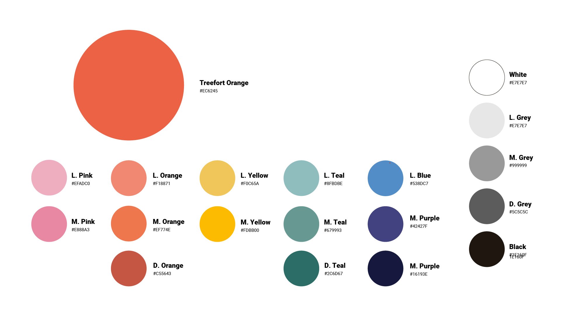
The Colors
The Treefort Orange was tested to ensure ADA compliance. The origins of the final selection was based on the 5 varying oranges used throughout the years. The supporting colors were pulled primarily from year 7. The analogous range of colors gives the overall treatment a warmness that makes the festival feel fun and playful.

The application
The application of all of the elements paired with James lloyds unique illustration style brings to life the fun and excitement that the pioneers of treefort felt when they started 10 years ago. From merch to signage, posters, banners, and more bring the familiar elements from our audit showcases the most memorable parts of treeforts 10 year anniversary.


