Wine Imports
Vinspire
Contracted by Owner Neil Grant to design a brand identity for Vinspire which focuses on wine imports to the US and distribution in Boise Idaho. Most of the wine imports in the market were saturated with traditional serif fonts, globes, stamps, and an overall heritage look. Vinspire set out to be sleek, modern, clean, and bold. The font was designed to nod to the traditional usage of serifs in the industry but take on a cleaner harder sleeker edge.
Role:
Creative Direction
Identity Systems
Graphic Design

Approach
Phase 01: Audit
Audit the market to find opportunities for differentiation.
Phase 02: Research
Research possible directions and inspiration.
Phase 03: Design
Design 3 visual identity systems to present.
Phase 04: Test
Test identity systems scalability and compliance.
Phase 05: Document
Document assets for brand consistency.
Phase 06: ADoption
Adopted by owner with provided assets.

The Problem:
As you can see above most of the wine imports in the market were saturated with traditional serif fonts, globes, stamps, and an overall heritage look.
The objective:
Create a visual identity system that’s unique in the market but also works responsively and feels classic but contemporary. Vinspire set out to be sleek, modern, clean, and bold. The font was designed to nod to the traditional usage of serifs in the industry but take on a cleaner harder sleeker edge
The Solution:
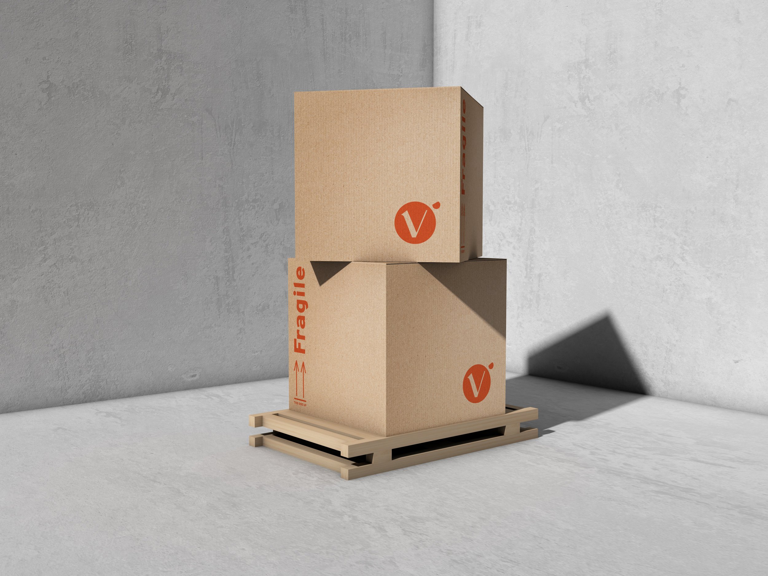
Use a serif style font that uses a combo of curves and straight lines to create a look that nods to contemporary design while still feeling balanced and sophisticated. Paired with a color palette that is complementary but using a muted blue to make it feel somewhat brute paired with a bright orange pop.
The logotype was built off the foundation of the font Avgaf, a stencil like font that has decorative elements reminiscent of art nouveau. The class and sophistication associated with the font allowed for a responsive logo that's classic looking but the curvature paired with hard, angular edges makes it feel contemporary.

Overpass was designed as an interpretation of the well-known “Highway Gothic” letterforms from the Standard Alphabets for Traffic Control Devices published by the U.S. Federal Highway Administration. To help better tie the idea of travel Overpass was used to pair with the logo and other applications throughout the visual identity to make the overall appearance feel more industrial.


An identity that has a mix of sophistication and industrial is paired with a complementary palette, inspired by the bold colors of gulfs racing division the blue was made to feel matted almost gray, giving it a bold base for a nice orange pop, used as an accent to draw attention to important information and calls to action.
