Brewery Rebrand
Woodland Empire
Woodland Empire was Founded in 2012 by Keely and Rob Landerman, who spent a decade creating a brewery irreverent to the bearded hipster craft beer culture. In 2022, Progress Through Beer LLC acquired the brewery based on their respect for the previous owners' love of beer tradition and the level of quality ingredients they used in their recipes. The new owners, however, realized that they would need to establish a refreshed brand for Woodland Empire, as the company lacked messaging, a consistent logo, color palette and can design. With a whole new line in production and a push to grow the business, Progress Through Beer was not only looking for a way to stand out in the crowded Boise craft beer scene, but to reflect their commitment to being more than a brewery.
In collaboration with Brooke Foster our role was to establish the brand's core values, messaging, visual identity system and packaging to create a new and improved Woodland Empire. Over the course of 6 months, we worked with the team at Progress Through Beer to bring their vision of a unique, recognizable and youthful brand to life.
Role:
Creative Direction
Identity Systems
Graphic Design
Packaging Design
Messaging / Copywriting
The Problem:
Woodland Empire, being a grassroots business, meant the owners had to wear multiple hats, leaving behind consistency and messaging that most consumers need in order to build a relationship with a brand. The lack of brand equity in the Boise area meant that the new owners, Progress Through Beer, needed to find a way to re-establish themselves in the market. In order to reach a broader audience, Woodland Empire would have to rebrand itself, incorporating a consistent visual identity, and messaging for their new product line.
The Objective:
Internal Core Values should be put in place to encourage consistent decision making between members of Progress Through Beer. With equal importance, outward messaging is needed to reflect the personality of the owners and their collective desire to maintain beer traditions and locally sourced ingredients, as well as a shared belief that the brewery can be used as an outlet to do social good. Omission of the previous brands visual assets can be replaced with a new visual identity that feels unique in the market, while harnessing the fun and playful spirit of previous ownership. This visual identity includes easily recognizable and consistent packaging that differs from the competitors in the local market.
The Solution:
Our solution is a full re-brand of Woodland Empire as an effort to create internal and external consistency within the brand. Additionally, the emphasis on core values and the reflection of those beliefs in the beer can create brand equity through relating to folk who love doing social good and who love beer. Our audit of the current local beer market revealed a need for a visual identity and package design that felt fun and playful while still looking classic and approachable to a larger demographic.

Approach
01: Audit the market to find opportunities for differentiation.
02: Research possible directions and inspiration.
03: Design 3 visual identity systems to present.
04: Test identity systems scalability and compliance.
05: Document assets for brand consistency.
06: Adopted by owner with provided assets.
Market Research:
An intensive and deliberate study of both local and national competitors was conducted. We analyzed the strengths and weaknesses of brands the clients admired and began understanding how our brand could function similarly, while having its own unique identity. Consideration of color, style, font and other design elements were compared against the competitors in the beer market.


Brand Messaging:
In order to determine how the brand should talk about itself, we lead the clients through different messaging exercises. After multiple rounds of revision, we established a UVP, four core values and a purpose statement that would direct their decision making in regards to the brand.


Visual Identity:
The new Woodland Empire identity was designed to stand out against the local competition who all tend to use treatments that are more hard edged and serious. The new logo was designed to be responsive. In some applications, the mark goes from the wordmark to the monogram and down to the Icon (king squirrel, acknowledging woodland creatures everywhere). The mascot, Big Sticky, is our biggest nod to previous ownership, as their old mascot is re-imagined and simplified into a friendly, beer loving character. The brightness of both the blue and yellow contradict the more muted qualities that some breweries exude in their color palette.


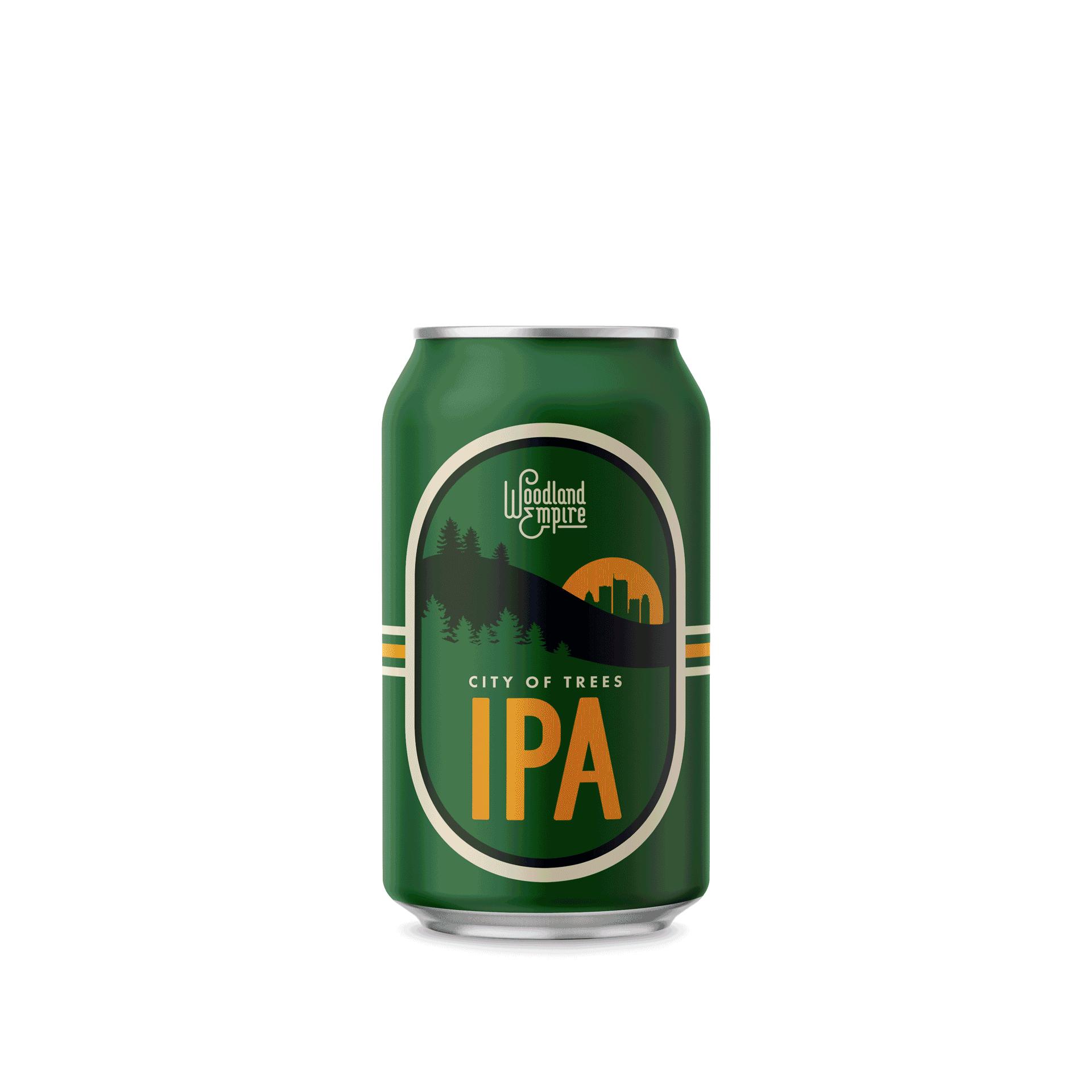
Packaging:
When it came to package design, we wanted to establish a system that borrowed from older concepts while applying new conventional ideas to make it pop off the shelf. The oval is borrowed from heritage brands like heineken. The swoosh in every label was adopted from the classic can designs of pepsi and coca cola. Inspired by the silhouettes found in Wes Anderson’s films, we used it as a platform for story-telling, creating bold visual elements that tie the beer name to the artwork. The choice of highlighting the beer style first was to help consumers find what they liked before diving into the nuanced designs and information placed throughout the can. This design system took months of testing to find the easiest formula that can be repeated while still having a sophisticated yet familiar appeal to beer buyers.

Old Boise Brand: can Design Refresh
Old Boise Lager was one of the original offerings from woodland that had some what of a cult following. The beer was first introduced by Keely and Rob as a heritage beer. Similar to brands like Pabst Blue Ribbon, Miller, Bud, Shlitz, Hamms, and so on. To honor the old design we looked at these heritage brands and worked around the existing design established by rob, and integrated some of the new brand fonts and gave the old design a face lift. The result is a heritage looking beer made wito 100% Idaho sourced ingredients.


